Good/Bad Website Smackdown
I believe that my examples of a good/bad website match the guidelines very well. My example of a bad website was Craigslist and the first example of this website not being good was the visual design of it where there was no pictures or even neatness to it. Like one of the websites said your brand is your image so you want to make sure that customers see something and it reminds them of your business. When you go on Craigslist everything is just a bunch of blue hyperlinks on a white background. There is also no live chat for Craigslist, it just brings you to more hyperlinks to click through if you need help.
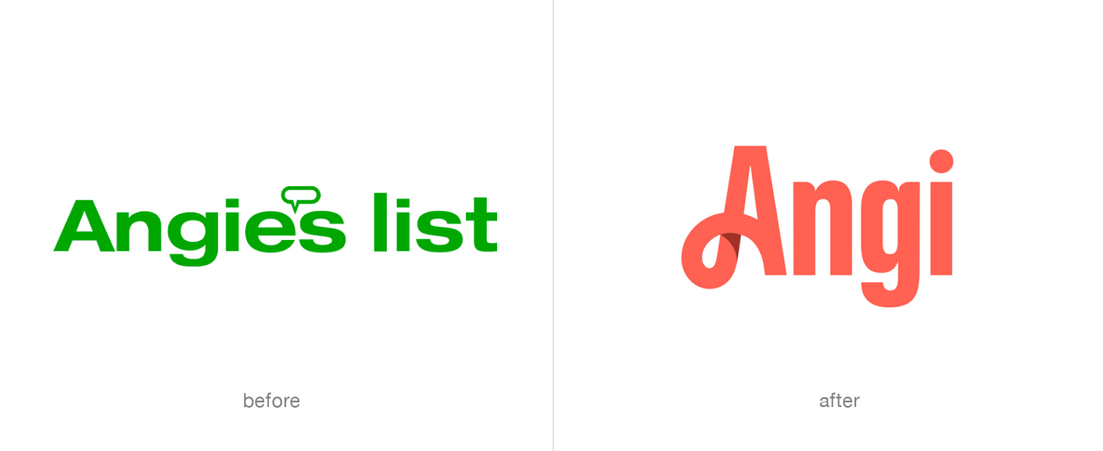
Even after going through a branding change Angi still had a very good website that was even easy to navigate through and it actually looked good visually. The website, What makes a good website, it states that your brand color should be on the website so people can remember it and most of the color on theirs is the new Angi red that they have. Angi also has a good load time for how much information they have stored on their website. Once you put your information in it will find many contractors that are willing to help you with the projects that you may have. In my opinion, Angi was a very good website especially compared to Craigslist.

Zack I agree that all the hyperlinks that basically make up Craigslist is annoying as it does not aid in consumers finding the appropriate sales page at times. With there being no chat for support from others even customer service I can understand why it is easy to get discouraged and lost while navigating the cite. Compared to Angie there is a stark difference as it seems more appealing and there is a way for chatting with others if interested in either work or sales.
ReplyDeleteZack, you did a great job explaining both websites, and I like using Angie because it's easier to navigate.
ReplyDeleteZack, I have never heard of Angie's list, but knowing that it exists now is a good resource for me to use in the future. It seems a lot more easy to use in comparison to Craigslist. It does seem more appealing than Angie's list, but it isn't good for consumer's support.
ReplyDeleteZack, I completely agree with you that Craigslist’s visual design is very bad. It results in many setbacks within that company and they should revamp their website soon. This would bring in new users and a marketing tacktick for Craigslist. When you compared Craigslist to Angi, Angi is by far the winner. The key difference between these two websites, like you said, is the visual aspect.
ReplyDeleteHello Zack, thanks for sharing your 2.0 smackdown Craigslist and Angi. These bad websites need to see that a clear structure, easy-to-use navigation, and non-distracting design are also a big part of their selling points.
ReplyDelete